![!\[\]\(/images/logo.png\)](assets/vilogo.gif) Overview of ADVIZOR Analyst
Overview of ADVIZOR Analyst
ADVIZOR Solution’s ADVIZOR Analyst is a flexible environment and platform for doing ad hoc data analysis and rapidly building interactive visual query and analysis applications.
ADVIZOR Analyst supports the full range of analysis activities:
- Prepare: acquire, clean, and transform data.
- Plan: hypothesize about data, prepare a strategy for answering questions.
- Explore: use charts to execute the analysis plan.
- Present: format results as a convincing presentation to others.
- Manage: organize windows, take notes.
- Assess: validate observations and conclusions.
- Re-Orient: review progress against goals, especially when the analysis spans multiple sessions.
Work with ADVIZOR Analyst like this:
Start with a Business Problem
ADVIZOR Analyst is a tool for answering business questions based on data. You start using it with a business question or problem in mind. Your business question may be simple: what are the interesting relationships in this data? This leads to ad hoc analysis, looking at data to find the relationships within it. Or, you may start with a concrete business problem: who are my best customers, what makes a promotion successful, which employees are most productive, etc.
With a problem in mind, you need data that can answer the question.
Get Your Data
ADVIZOR Analyst provides easy connection to a wide variety of data sources:
- Text (or CSV formatted text),
- Microsoft Excel spreadsheet,
- Microsoft SQL Server database,
- Microsoft Access database,
- Oracle database,
- Certain ODBC-compliant databases, such as MySQL.
Once data is accessed from a source, the connection may be remembered and reused in a subsequent session.
Data to be imported from a source may be examined or have its characteristics changed during loading using the Project Workshop. This may also be used to set the Statistical Data Type needed for Predictive Analytics, and to set the string used to display missing values.
Data Is Stored in a Data Pool
Data is stored in memory in the "Data Pool". This is an in memory repository that is shared by all ADVIZOR Analyst charts and displays. The Data Pool:
- Provides a simple relational model for representing data: data fields are collected into tables.
- Fields may be incorporated in a table from other tables by "copying" them, and tables may be linked to copy data between them.
- Data fields have a storage type of string, integer number, floating point number, and date/time.
- Fields also have a Statistical Value Type of Nominal, Ordinal, or Continuous; this is set in the Project Workshop. It is used by Predictive Analytics (below).
- Unlike the traditional relational model, however, all ADVIZOR Data Pool tables have two additional attributes: selection state and color.
- If a Data Table row has been graphically "selected" to highlight it, it is marked as "selected". This selection is reflected in all charts that are showing data from the same table, even if they are not showing the same data fields.
- Color can be mapped to table rows based on data in the table (or linked from another table), and the same color is used in all charts displaying the same data. Colors can be customized with the Color Workshop.
- New data fields useful for analysis can be created interactively with the Expression Builder.
Explore with Charts, Visual Discovery, and Predictive Analytics
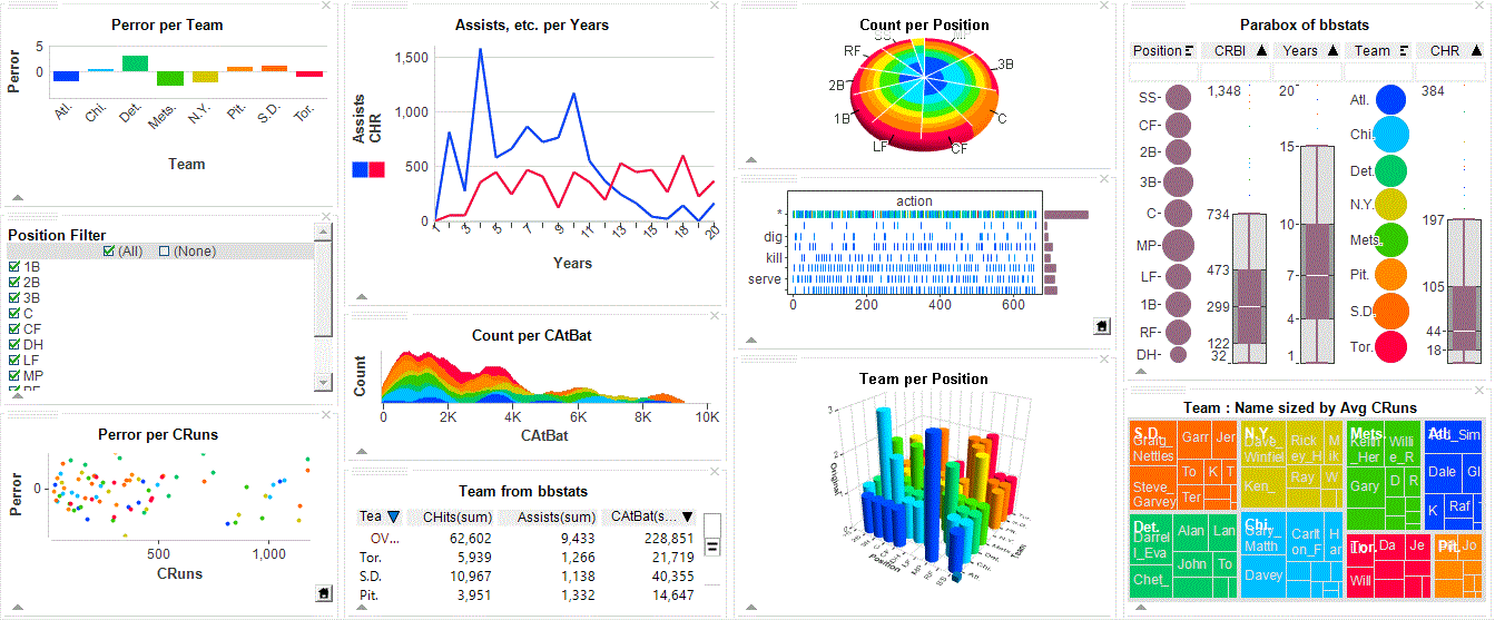
A complete set of both simple and novel graphical charts are available for representing your data:
- Bar charts, pie charts, histograms and line charts show the distribution of single fields.
- Scatter Plots and Multiscape show two-way interactions between fields.
- Data Constellations, a graph view, shows relationships and associations.
- Maps show how data is geographically located.
- Data Sheets display data details as a grid.
- Summary Sheets show aggregated measures for categories in fields.
- Counts gives simple statistics on fields.
- Time Table shows events and activities over time.
- Heat Map shows data aggregations by groups.
- Parabox shows multivariate relationships, including a parallel axis display.
Charts provide a standard set of ways of interacting directly with your data; taken together, these provide Visual Discovery:
- Coloring: map color to data.
- Selection: graphically sweep items in a component to highlight them. When items are highlighted, the same data in other visual components is also highlighted to better show the relationship
- Focus: show details of a particular item by pointing at it.
- Filtering: exclude uninteresting data to better focus on the interesting subset.
- Viewpoint: control your viewpoint by panning, zooming, and rotating. This is especially useful for 3D views, but even for 2D views such as bar charts, you can get an overview of thousands of categories and then zoom into a subset.
- Interactive reordering: reorder items (e.g., order of bars in a bar chart) to better show relationships.
- Interactive labeling: show details about an item by touching it.
- Aggregation: show the same data at differing levels of detail. Aggregations are automatically computed for you.
Once your data is available, its time to understand it. ADVIZOR Analyst helps you decide how to best visualize your data by letting you build a page by selecting charts and laying them out on a tab in the application. The size and arrangement of the charts is completely under your control.
<!---
A guide asks questions and creates a page based on the answers to these questions. Although this is unlikely to result in a sophisticated view of your data, it will provide a starting point from which you can begin your explorations.
A library of pre-defined page templates may be used as starting points for your displays.
You may build a page entirely to your design by selecting charts and laying them out on a tab in the application. The size and arrangement of the charts is completely under your control.
No matter how you start designing a page, you can manually modify it by adding or removing charts or by interactively changing the data displayed by a chart.
--->
Predictive analytics may be used to algorithmically find relationships in the data for you (Analyst/X only). The analyst selects a target field in a data table that represents a business question, and a data mining algorithm is used to find how other fields in that field influence that target. The graphical selection state may also be used as the target, so that a description of the selection state in terms of other fields is found. The target field may also be predicted for new data.
A successful data analysis session involves more than just visualizing data: the analyst must also understand what he or she is seeing, mark interesting states for later documentation or easy recovery, and generally control the application. ADVIZOR Analyst supports these activities:
- Chart properties are displayed as Property Grids that may be edited to modify the display and operation of the visual components.
- Color scales may be created and customized to reflect how the analyst would like to see the data colored.
- Data tables may be linked to support analysis of associated data in multiple tables.
- The current assignment of colors to data may be displayed in a color legend.
- Hierarchy relationships between table fields may be defined and used during the analysis to “drill up” or “drill down” through this hierarchy.
- For Server-based dashboards, a custom integration may be defined where the current set of graphically identified items is retrieved for formatting, reporting, or exporting to another server.
- Filters may be used to condition the data to focus on a particular subset.
- Sessions are stored with the current analysis state, and may include the loaded data or just the connection to the data source. Saved sessions can be restored.
Share Your Results
The result of data analysis is conclusions, which often must be incorporated as part of a convincing presentation. Results can be published in a variety of ways. The simplest form of sharing is to share images of the ADVIZOR charts. This can be done using a variety of formats
- Microsoft Word.
- Microsoft PowerPoint.
- Adobe Portable Document Format (PDF).
- Standard web HTML.
- As an image to the system clipboard for pasting into other software.
You can provide help to other people using the dashboard you created via Navigation Panes, documentation formatted as HTML pages that can be associated with each tab in a dashboard. The Navigation Pane for a tab can describe how to use that tab and where to go next. Since this is an HTML page, all of the capabilities of HTML may be used in the Navigation Pane.
Or Share your Results on the Web
A key aspect of data analysis using ADVIZOR is interactivity; this same interactivity can be crucial to presenting results as well as in discovering results. An ADVIZOR Analyst project may be published to ADVIZOR Server AE, which provides ADVIZOR charts in a zero footprint web page. This export requires no modifications or customizations to what was created during analysis, and no use of other tools.
A project published to ADVIZOR Server AE and viewed over the Web may is an interactive analytical dashboard. This same presentation may be used on an ongoing basis by updating the data to allow the same interactive presentation of data and analysis for new instances of the same data.
ADVIZOR Analyst projects may also be sent to other users of ADVIZOR to allow them to examine the same data. A read-only version of ADVIZOR, the ADVIZOR Desktop Navigator, may also be distributed to others for their use in viewing the analysis of another author, or to apply the same analysis to new data.
An interesting subset of data that has been identified in ADVIZOR Analyst may be exported formatted as a Microsoft Excel spreadsheet or as a text file.
The selected subset of data in an ADVIZOR Server AE-supported dashboard may be exported to a web page or another server.